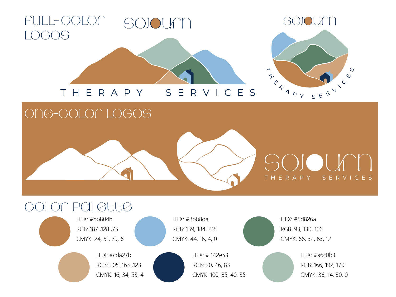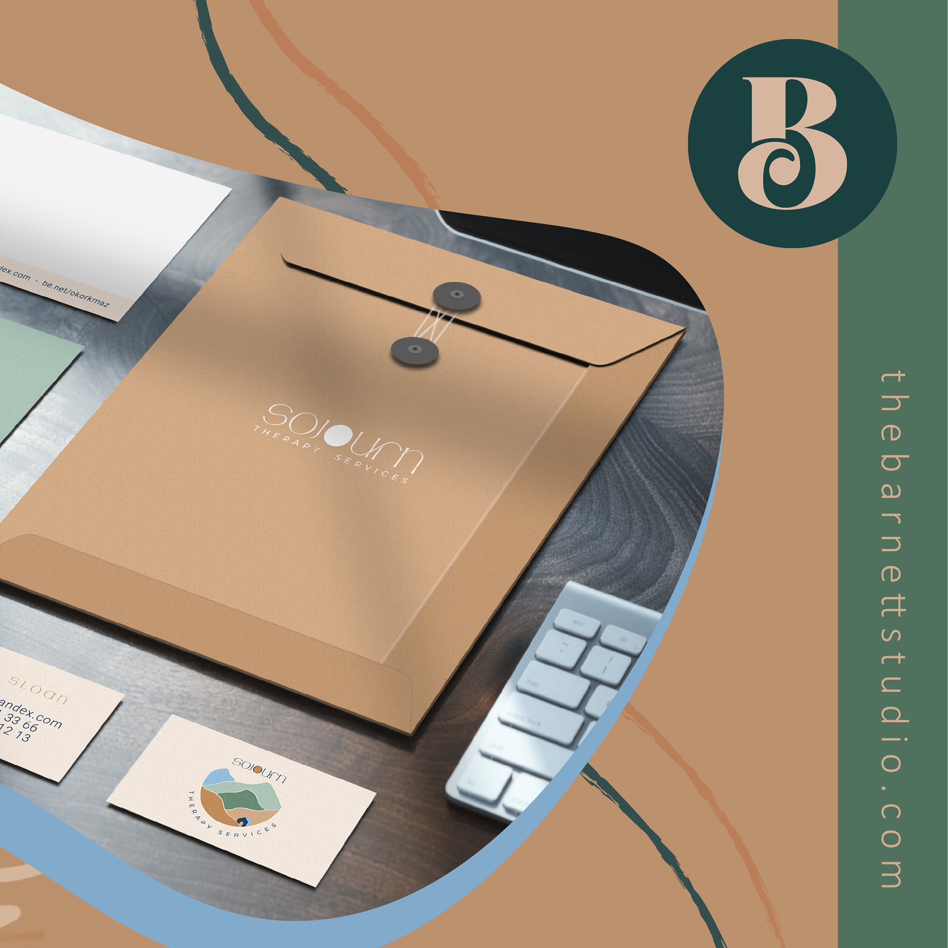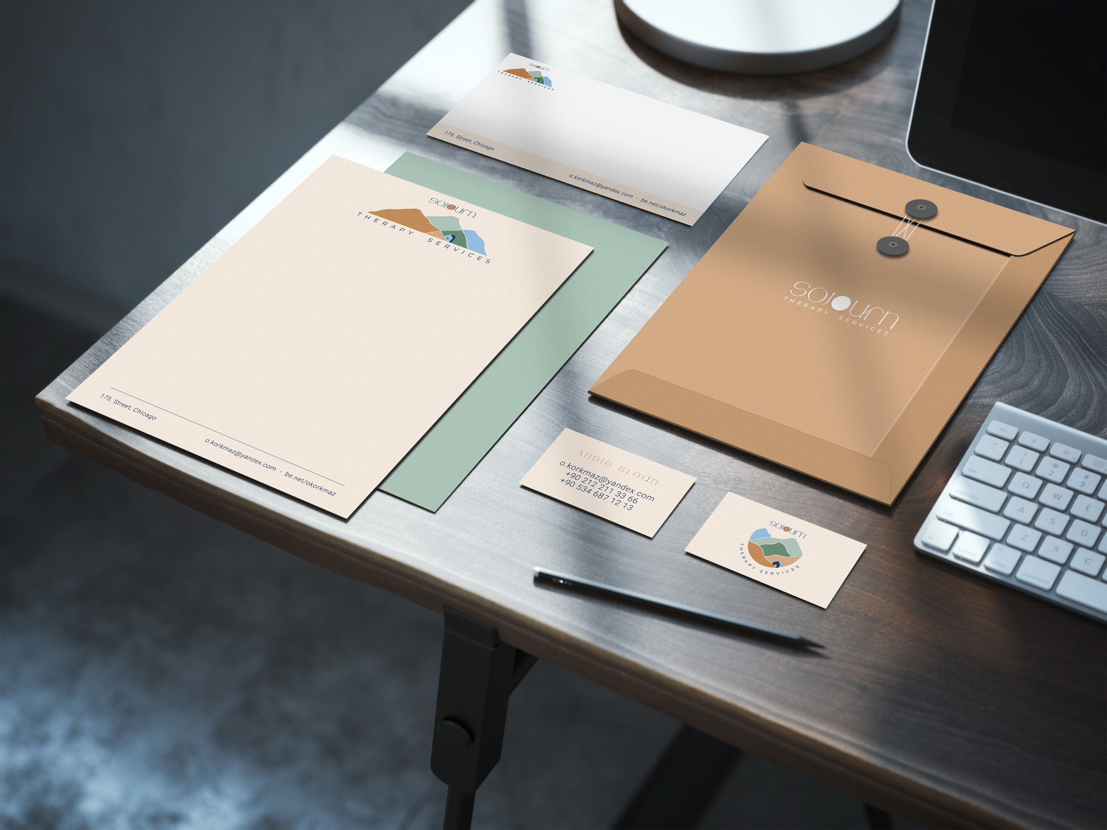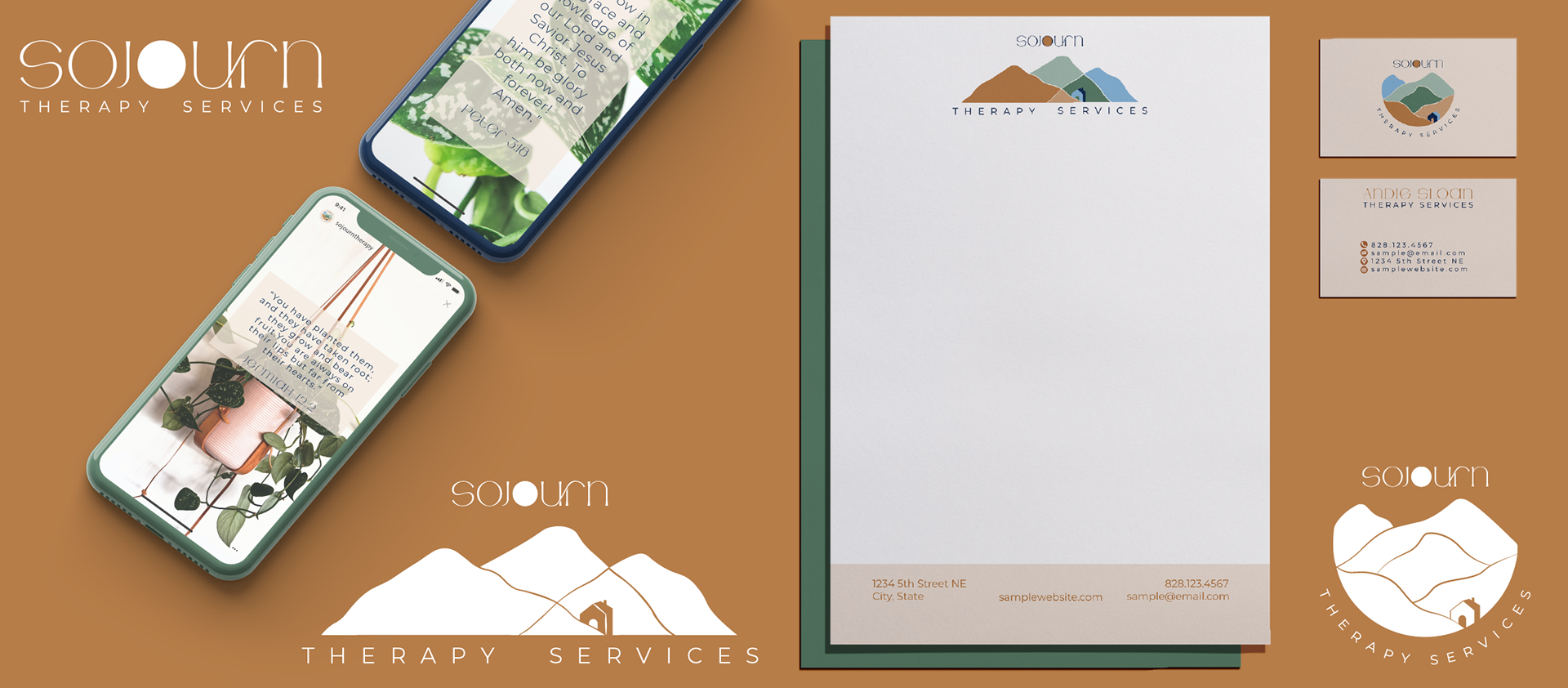
Design Objective: Andie Sloan is a therapist starting her own Therapy Services company. She needs a logo to use on her website and social media accounts. The name for her company is Sojourn Therapy Services. She wants the logo to include a simplified mountain, a cabin, and a modern typeface.
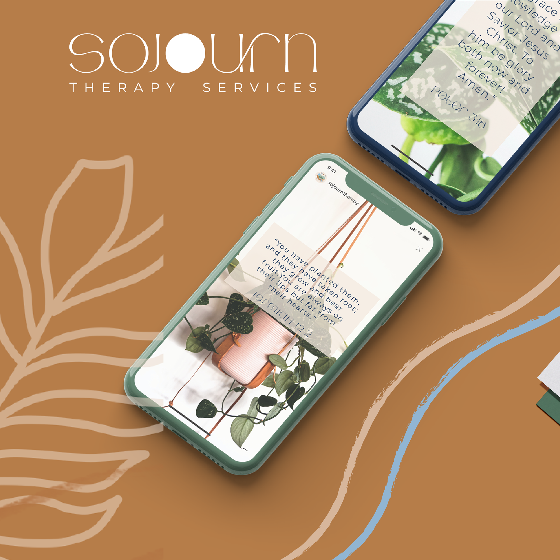
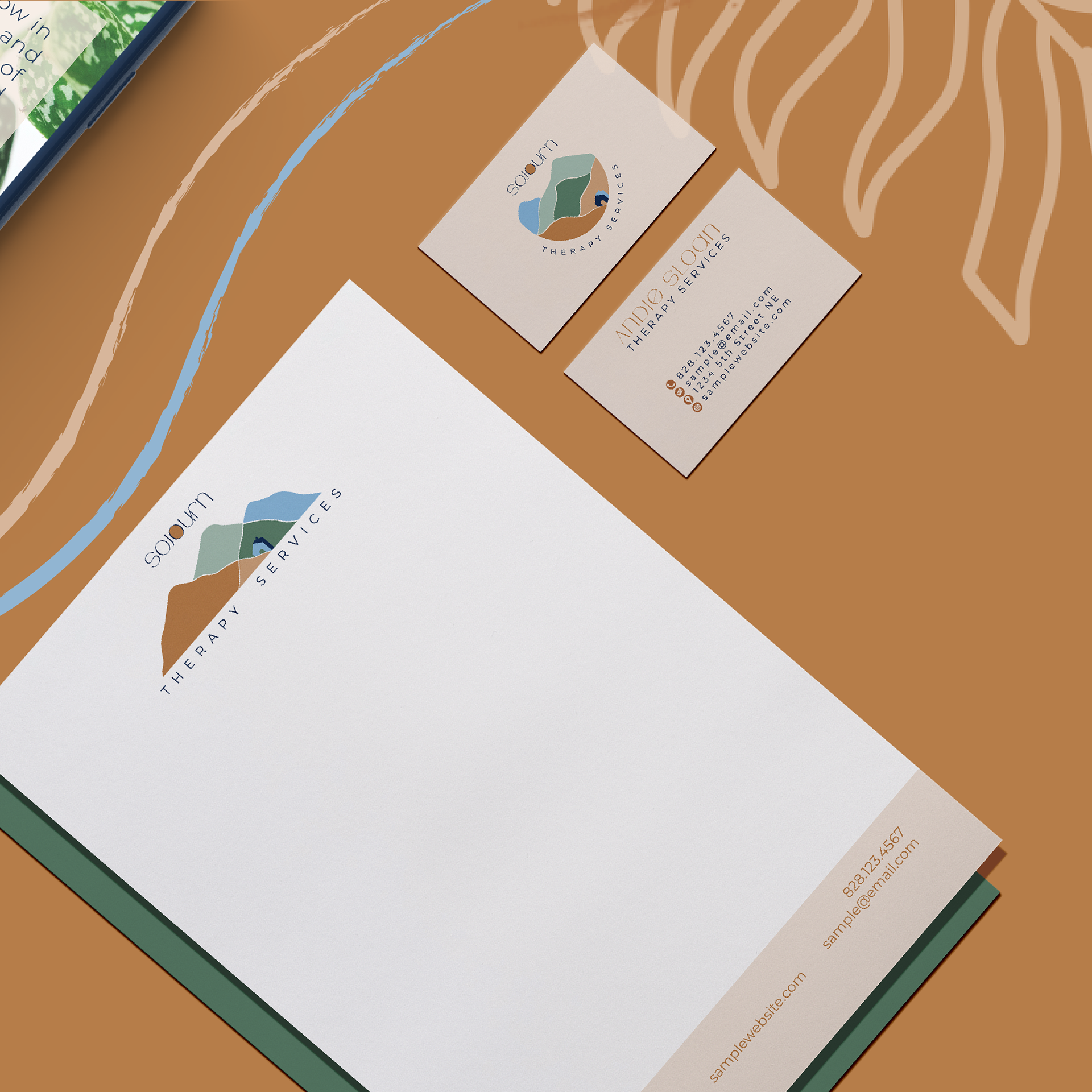
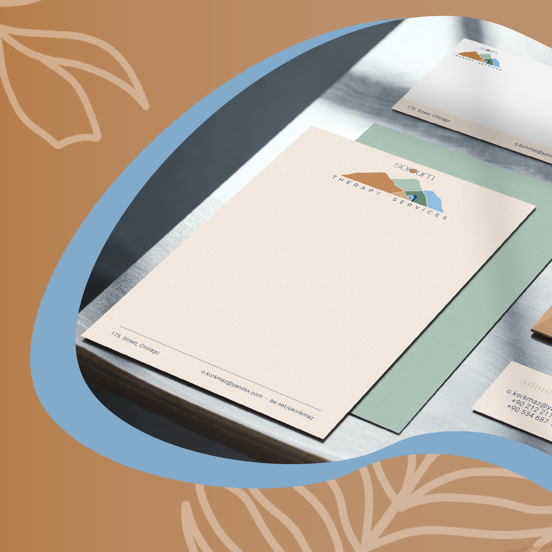
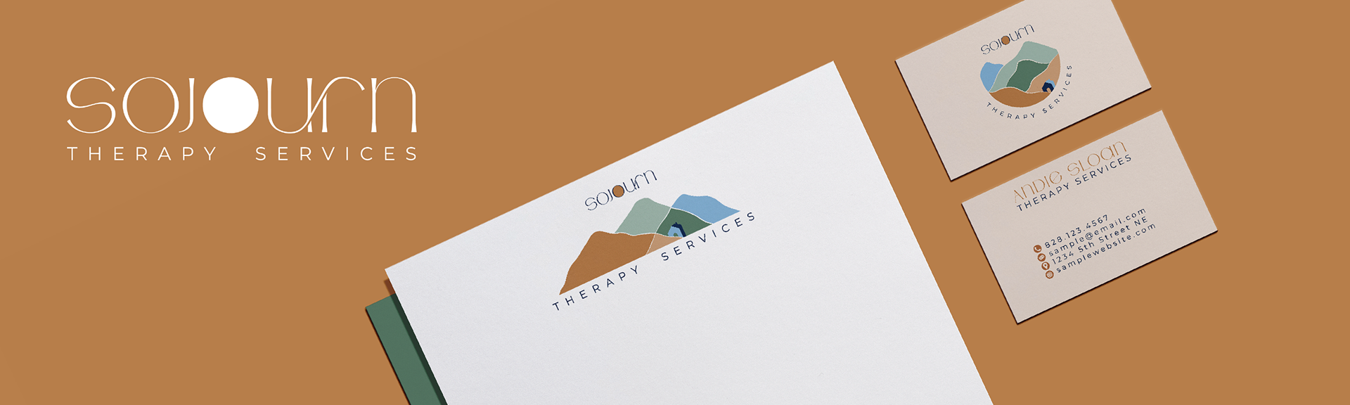
Design Brief: The logo for Sojourn Therapy Services invokes a feeling of serenity with the muted color palette and organic linework. The mountain range in the circular and horizontal logo overlaps and uses the given color palette in a color-block fashion. In this way, both logos can stand alone while also complementing each other staying true to the brand. These same shapes are used in the one-color logo while the cabin is created using negative space. The cabin nestled behind the first mountain stands out by using two blues that contrast with the warmer background colors. It represents the balance an individual can achieve by using Sojourn Therapy Services. The typeface for Sojourn is a modern typeface with flared strokes at the terminals of each letterform. U and R in Sojourn connect with a custom ligature giving the standalone wordmark more interest. The second O in Sojourn houses the sun rising over the mountain range signifying a new day and new beginnings. The filled-in O carries over into the one-color wordmark as well tying back into the original design.