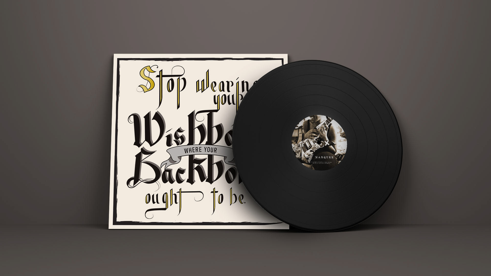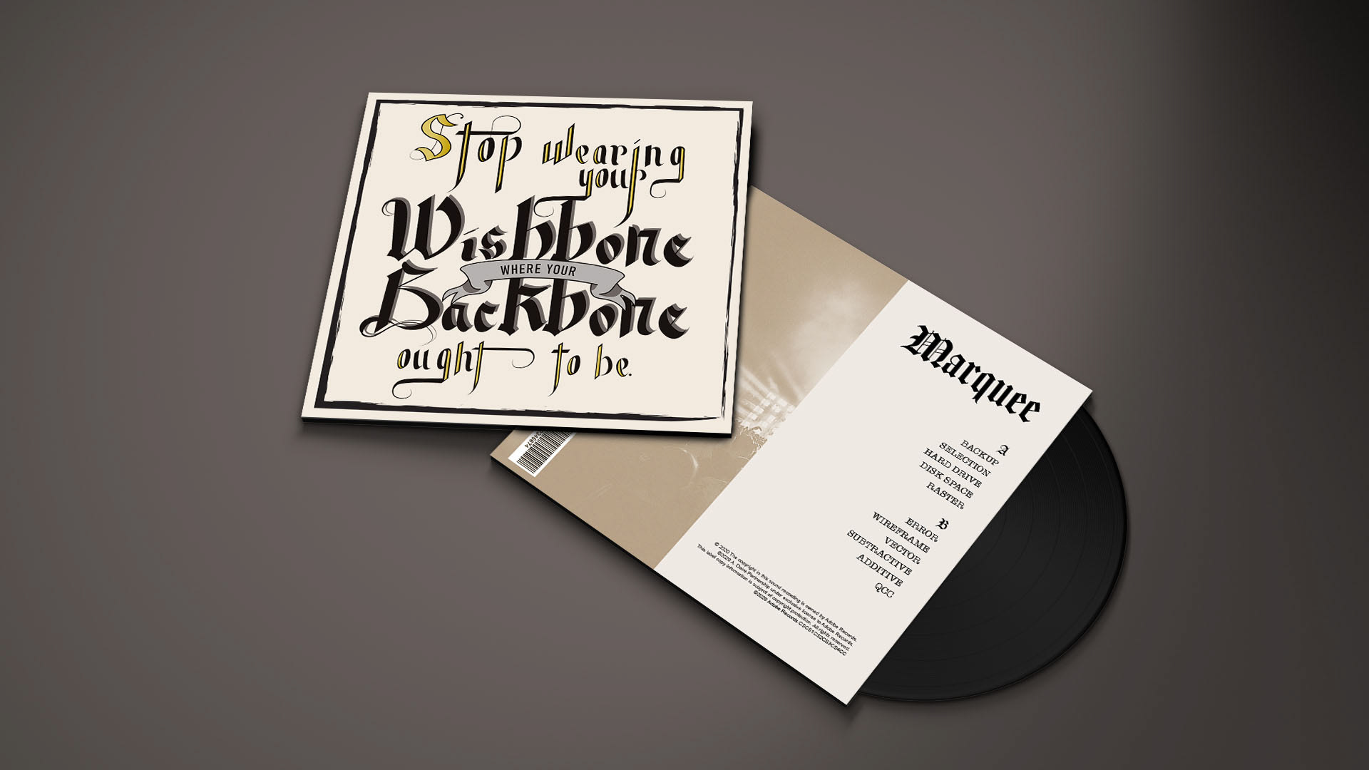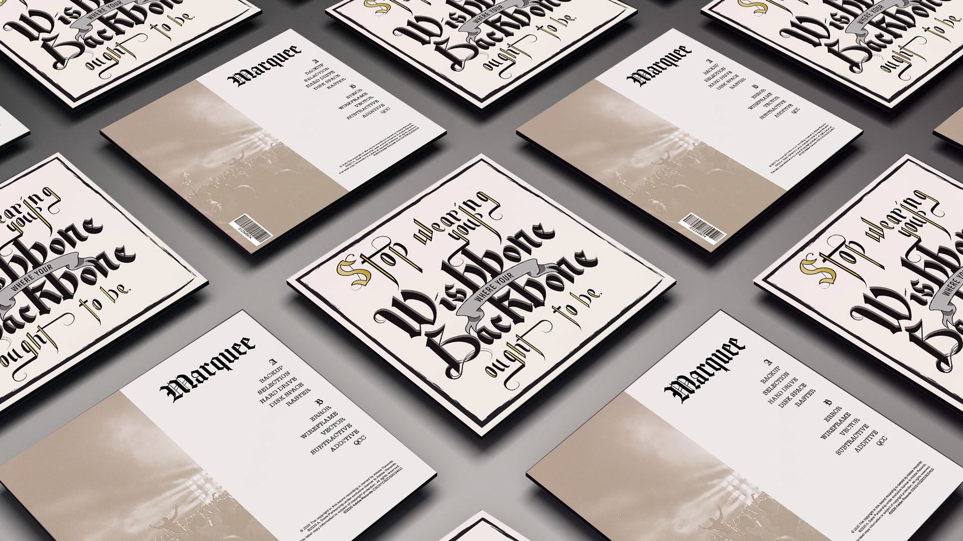
Design Objective: Create a hand-lettered typography piece using a quote, phrase, or lyric. Keep the styling consistent and explore hierarchy using type. Display a commercial use for the finished piece.
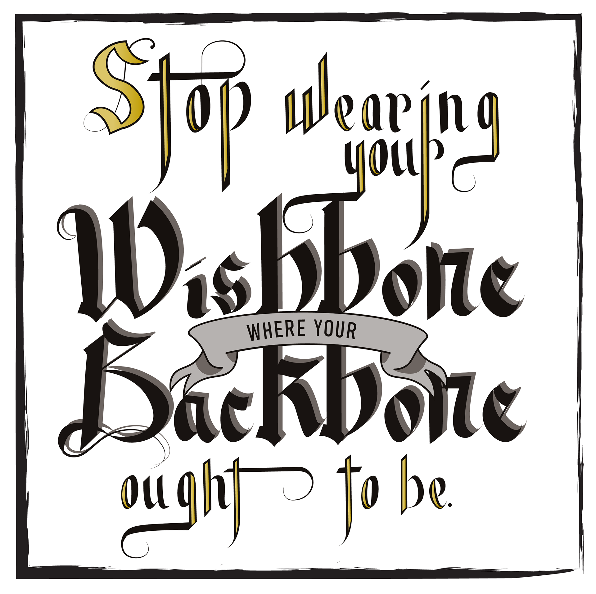
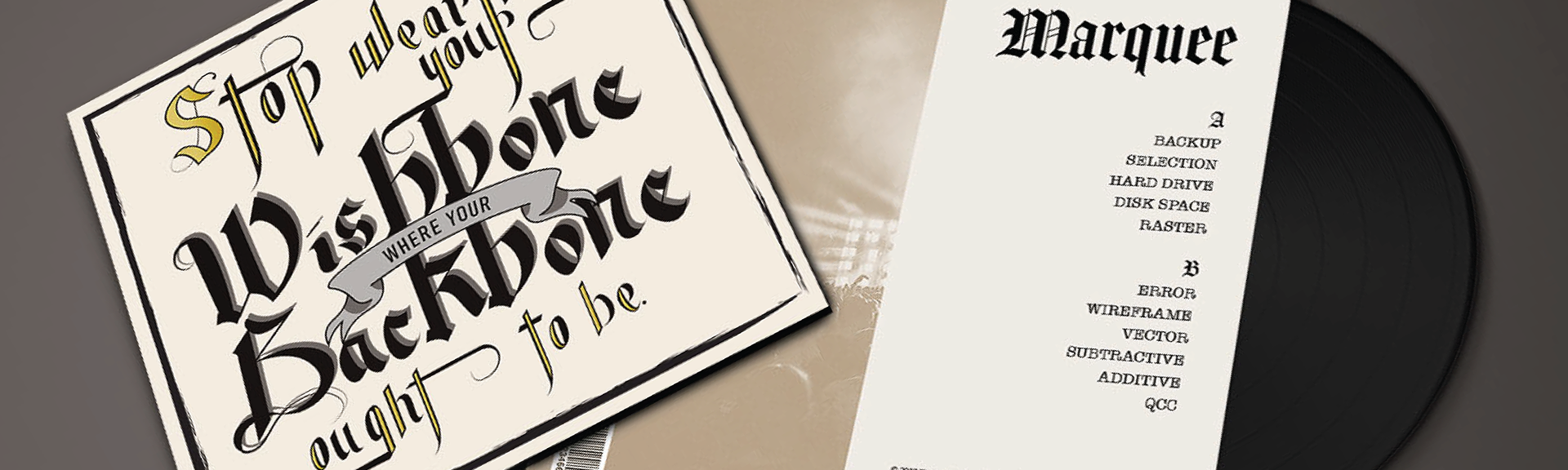
Design Brief: The phrase used here is a quote from Elizabeth Gilbert in the book Eat, Pray, Love: "Stop wearing your Wishbone where your Backbone ought to be." The style of this is reminiscent of the gilded manuscripts in the days before the printing press. Those hand-drawn works of art took whole lifetimes to create. The Blackletter typeface for the words Wishbone and Backbone is a sturdy, heavy font that represents the strength of a backbone and the quote itself. A simpler font with similar stroke variations and slanted terminals was used for the "Stop wearing your" and "ought to be" words to compliment the style of the aforementioned blackletter typeface. To create continuity throughout the piece some of the terminals and descenders on the letters extend into thin, curled flourishes. The color scheme is neutral black, tan, gray, and gold. The gold is meant to mimic the look of the actual gold leaf used in old manuscripts. This quote means an individual must replace wistfulness with courage to succeed. A backbone, albeit unseen, represents a person’s core belief; without it, one cannot stand up for what they believe in.