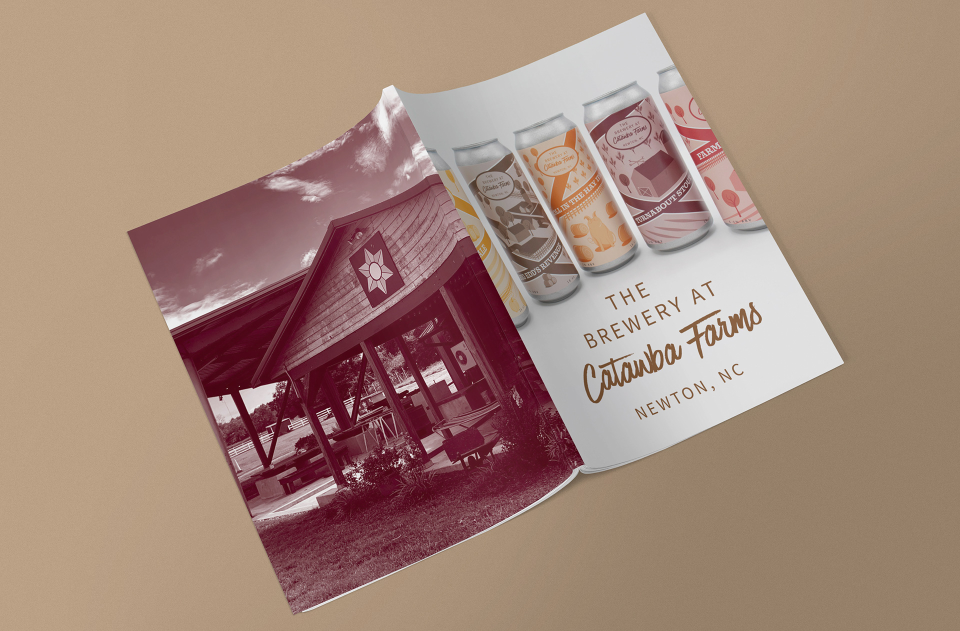
Design Objective: The Winery at Catawba Farms is a local vineyard that is looking to add a made-in-house craft beer to its menu. The company already has five predetermined beer flavors and names. Catawba Farms requires a series of beer can labels that match their aesthetic. They request that the Catawba Farms typeface and a short story relating to the beer be used in the can design. The principal owners have provided the short stories, ingredients per beer, and the TTB government guidelines.
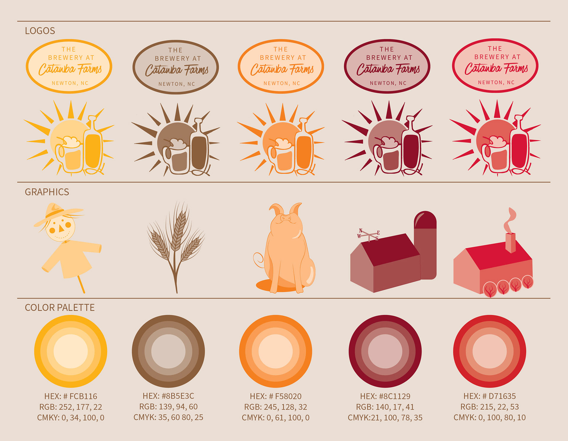
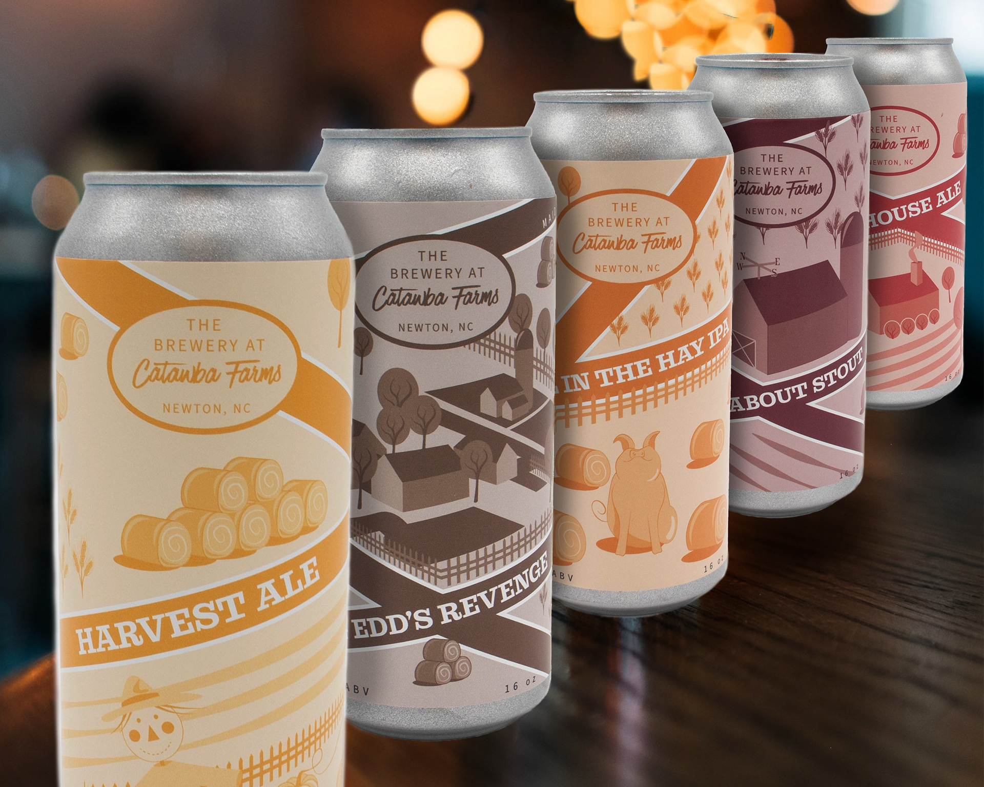
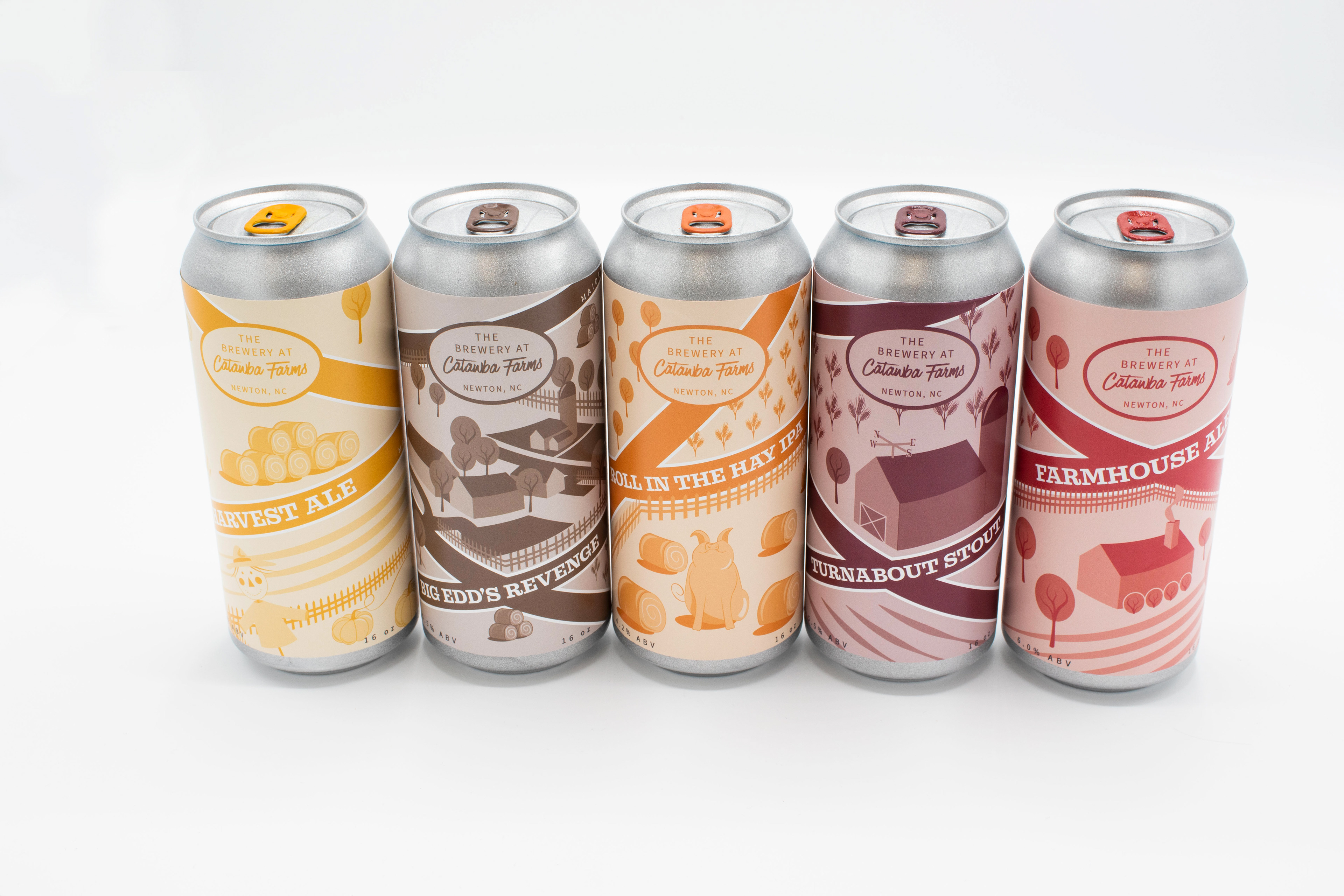
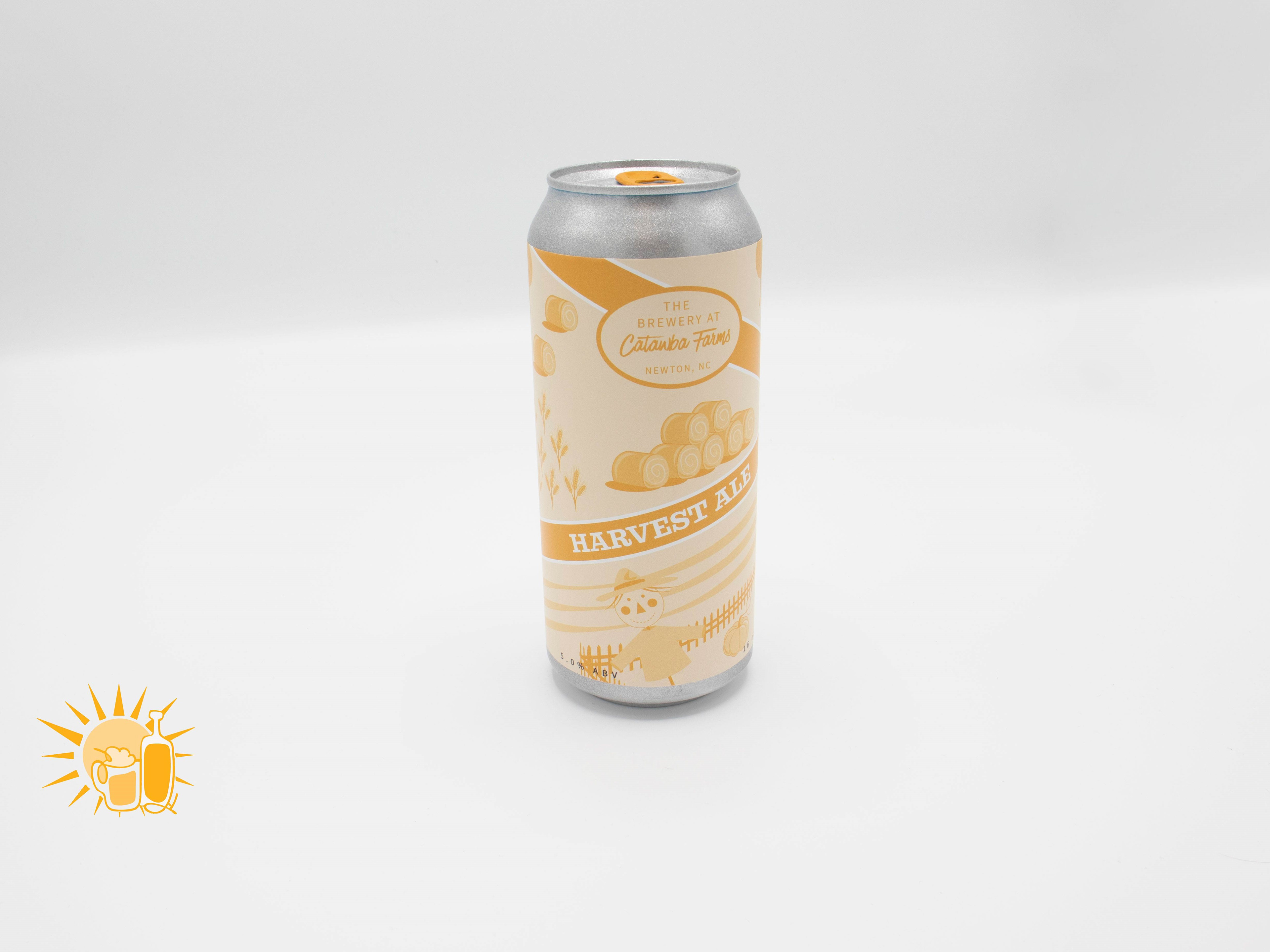
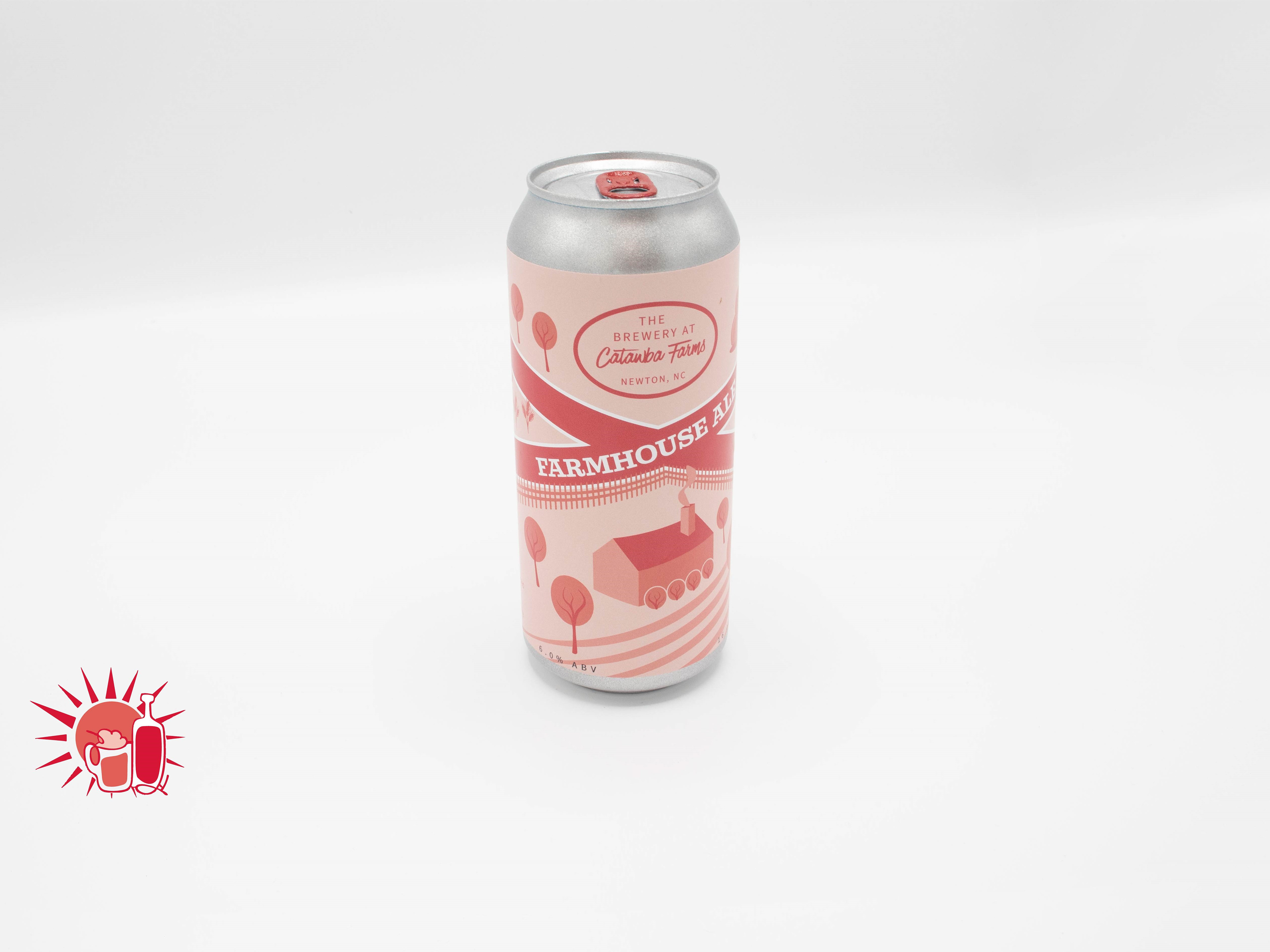
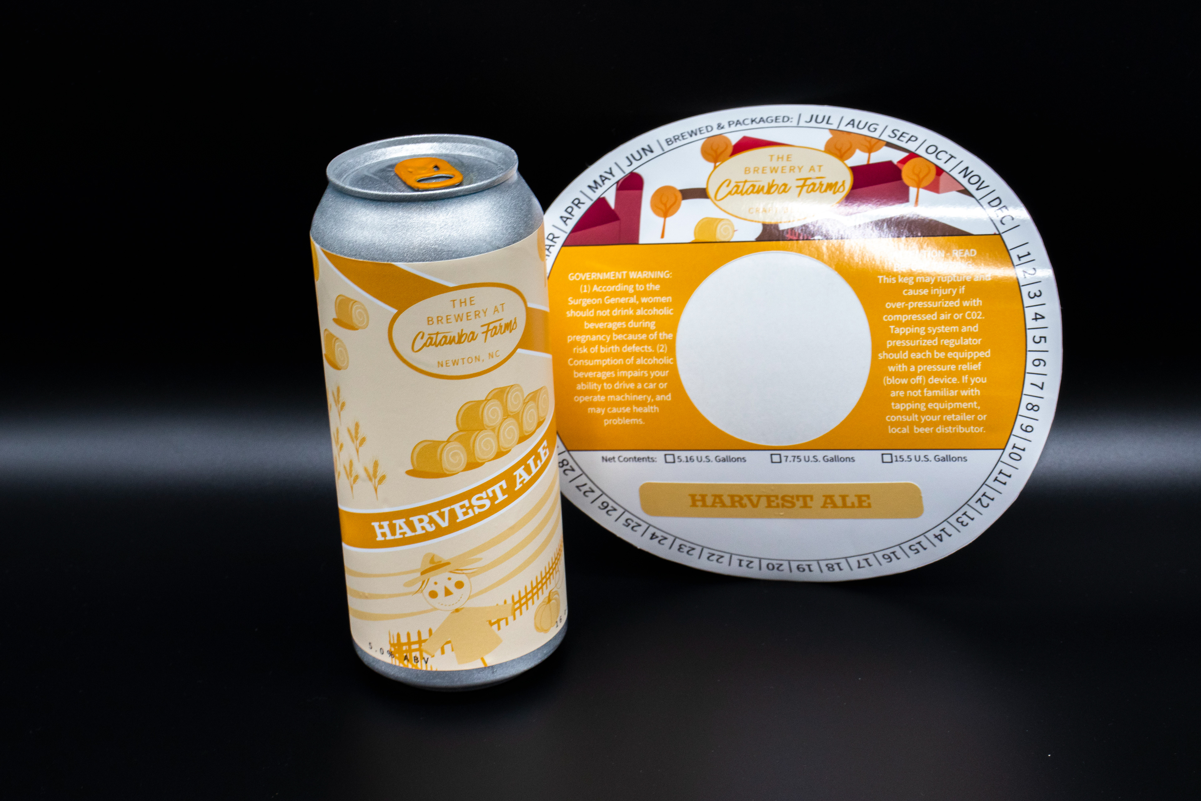
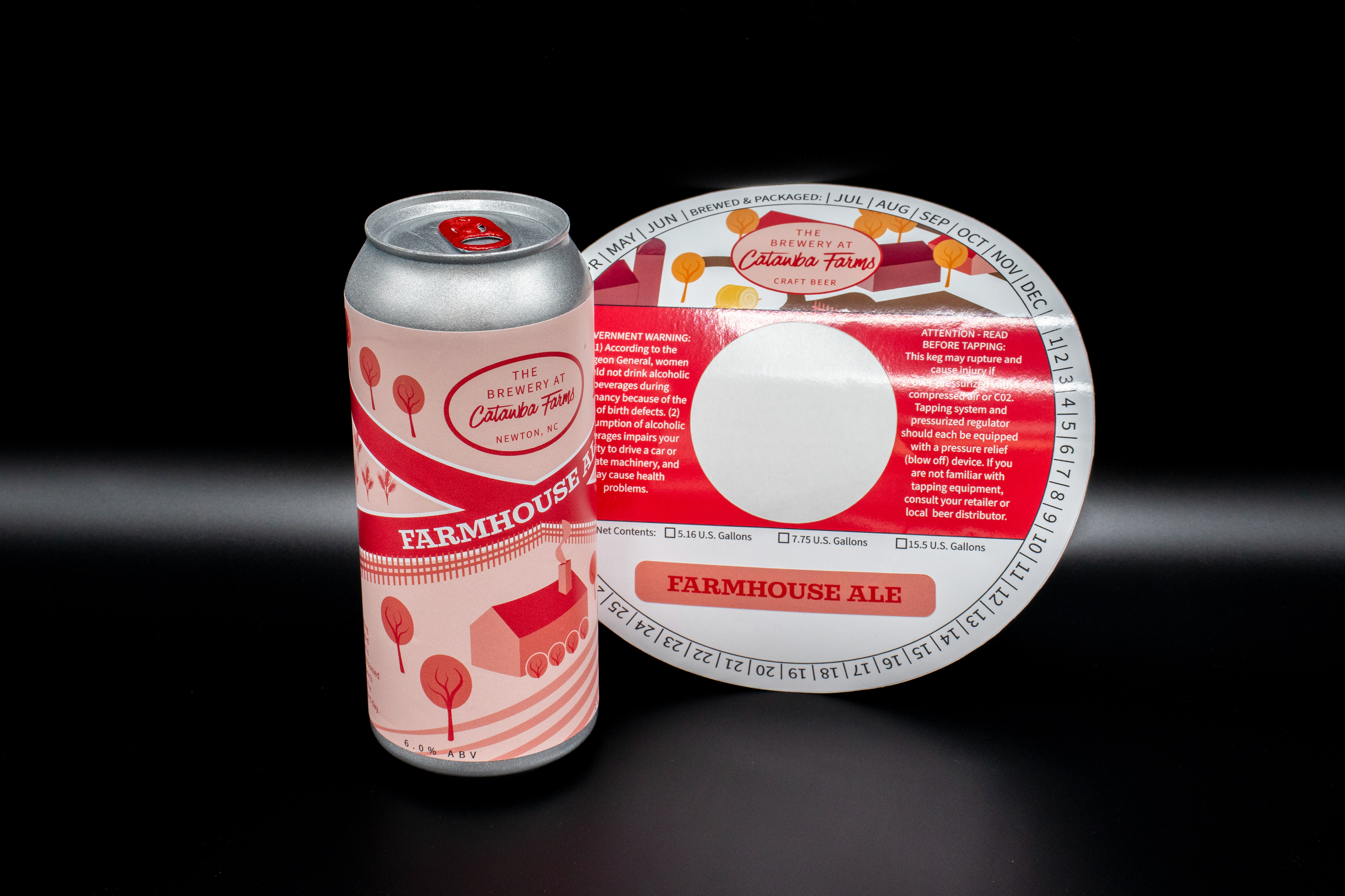
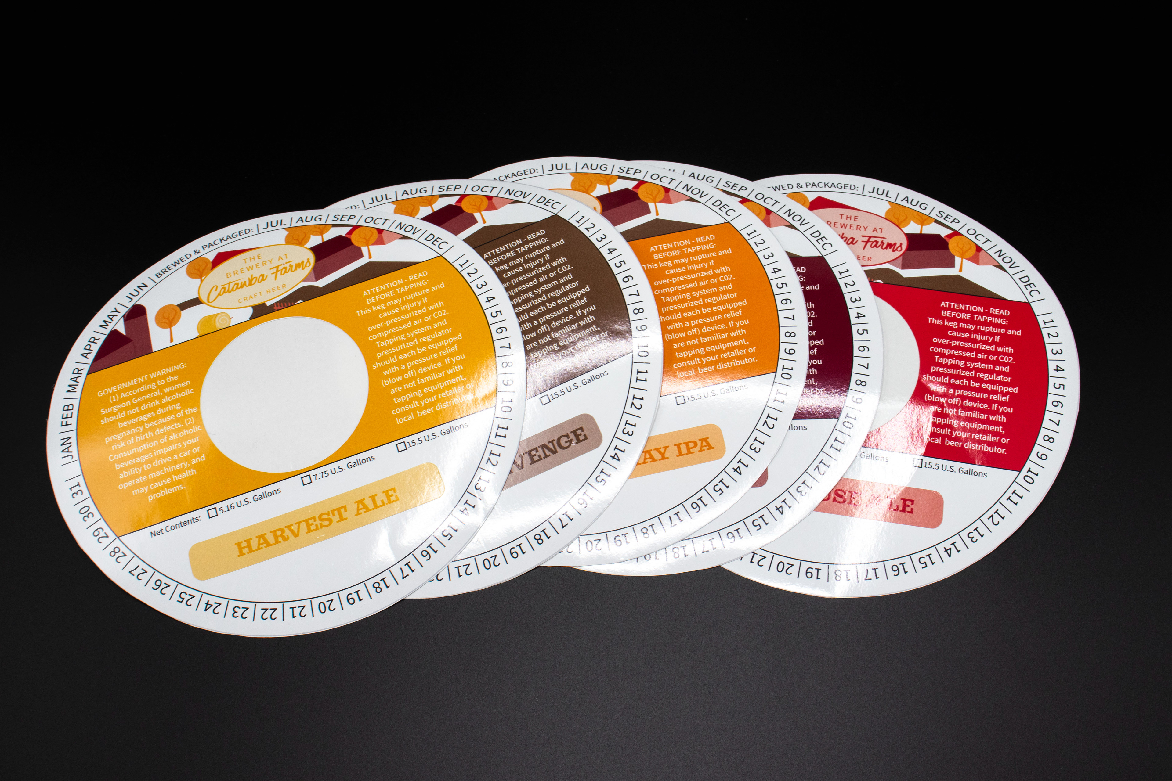
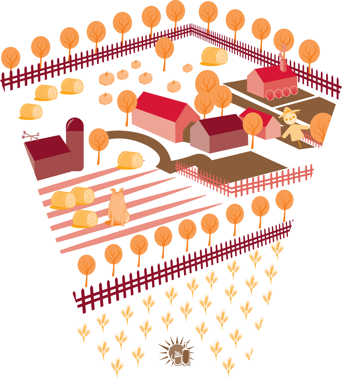
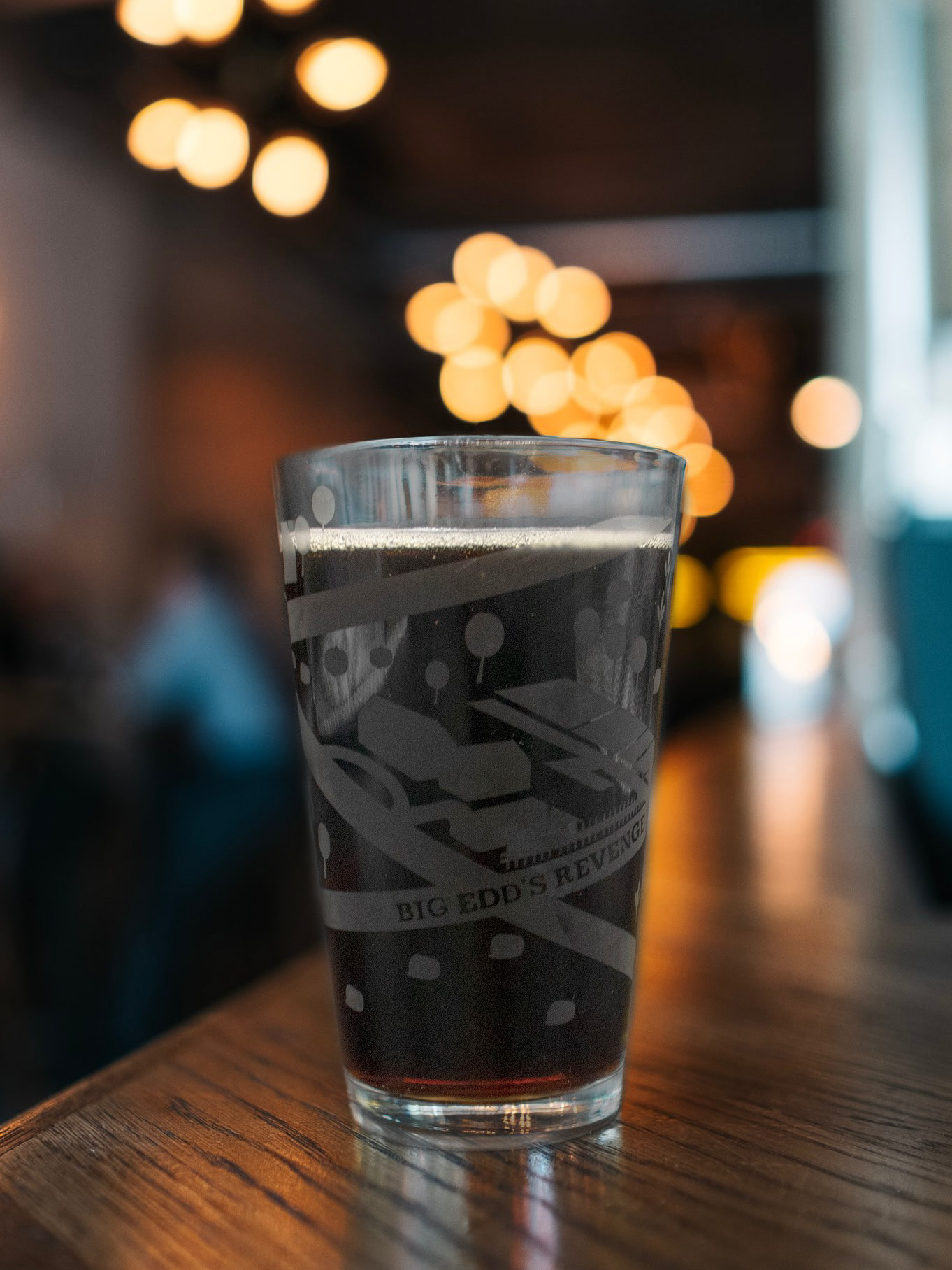
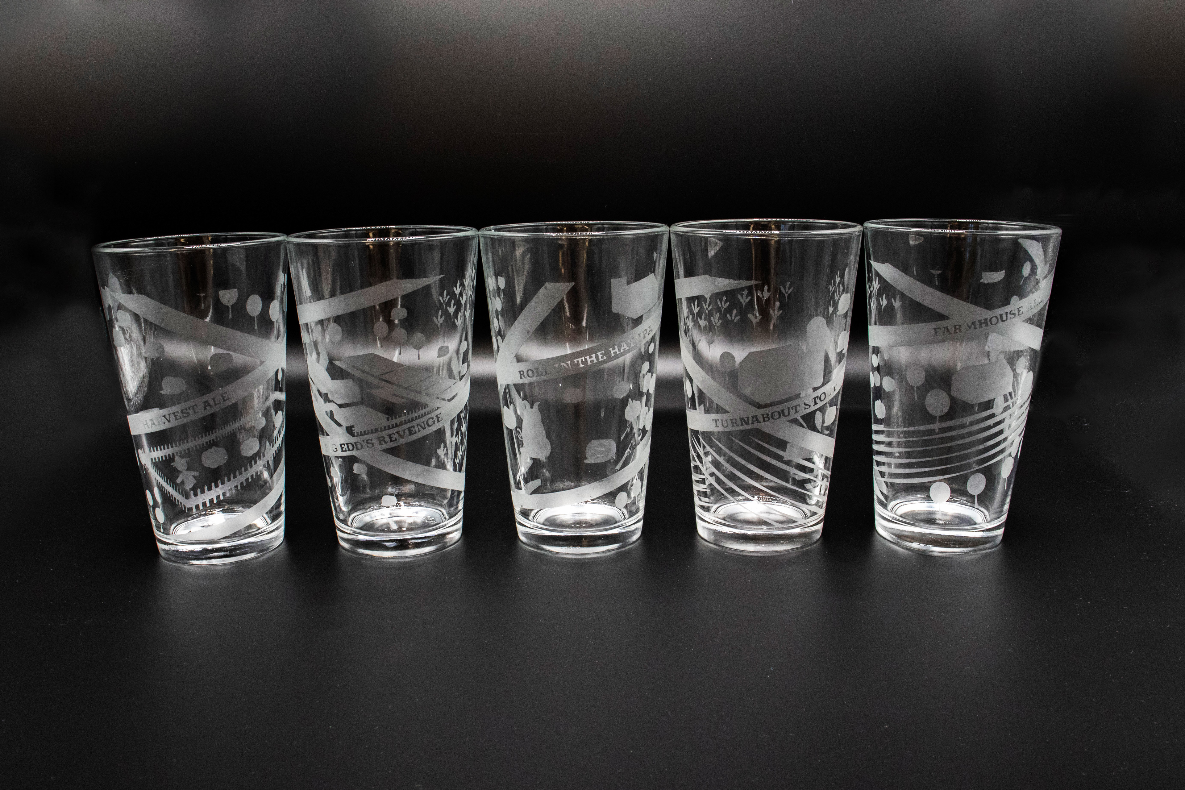
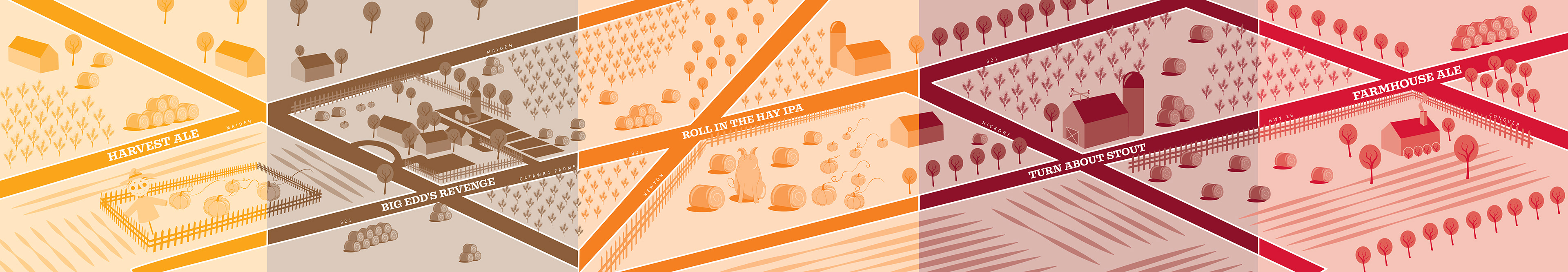
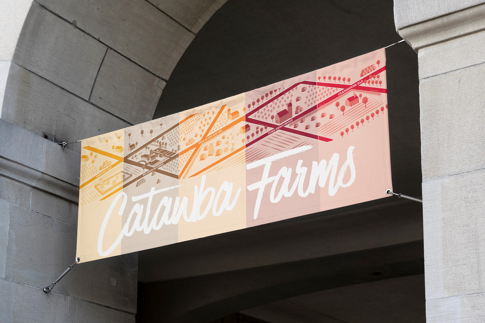
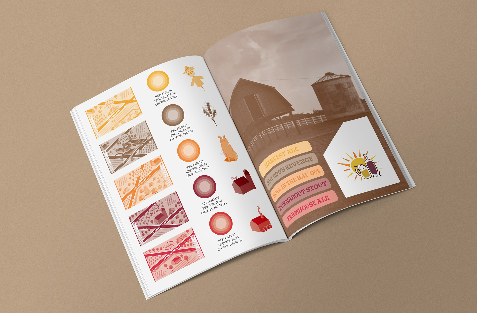
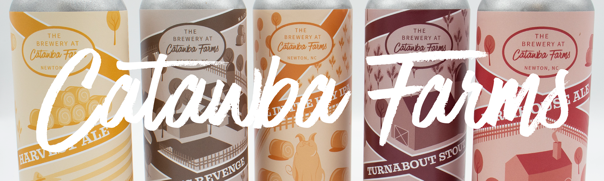
Design Brief: The Brewery at Catawba Farms prides itself on being a local brewery that sources its ingredients within 100 miles of the facility. This design highlights that unique selling point for the brewery by showcasing the cities in Catawba County. Along with their featured city, each can has a monochromatic color palette to provide a distinctive identity. The cans also feature a singular larger element pulled from the short stories featured on the backs of the cans. While each can is connected via the roads, they also feature repeating graphic elements, such as the bales of hay, stalks of wheat, fences, and houses. These elements help to portray the cans as a cohesive series. To help Catawba Farms brand their brewery further, collateral for the design was also developed. Coasters, etched pint glasses, tasting cards, and a large-scale connected poster were the collateral pieces chosen to best represent this design. These particular pieces of collateral were selected because the roads can easily connect in the same way the design of the cans illustrates, unifying the products.